Photographers have unique & signature styles that others try to emulate. All the kinds of things that go in a signature style, from the choice of subject matter to the shooting approach, equipment, and a lot of small choices are unique to every photographer and their situation.
One thing that can be emulated, however, is post-production. Everything your favorite photographer does to adjust color, contrast, and the look of their pictures, you can do too. Photographers will often shift one hue into another or desaturate some of the colors to achieve a unique effect that would lead them to create their style.
Before color, style isn't just post-production, but it is much of related to how an image is captured. Simulating effects like shallow depth of field and backlighting in post-production is usually an unconvincing substitute for a good gear, subjects, and technique.
Let us see how you can control for adjusting color in Adobe Lightroom. However, adjusting color can helps you create a unique style of your own.
Learn to Understand the Color Controls
It's important to understand color. When we talk about visual terms like hue, saturation, and luminance, it is sometimes difficult to understand how they affect an image.
- Hue
The terms hue and color are often used variably. The Color Wheel Artist's definition of hue is - the brightest 6–12 pure, unmixed pigment families on the Color Wheel.
In Lightroom, there is a provision to adjust hue as a color shift. You can move shades of blue into violet or red tones into the orange spectrum.
- Saturation
Saturation describes the intensity of a color in an image.
Technically, it is how much grey is mixed into a color value. The greyer, the more muted the saturation is.
Think of saturation as a volume knob for color. Turning the saturation up for a color will make it more present and noticeable. When we desaturate a color completely, it's removed from an image. In other hands, increasing the saturation will emphasize a color.
- Luminance
It describes the brightness of a specific color in an image, or how much black a color has. Pulling the luminance down for a color will darken all parts of the image that contain that color (adding black color). If you increase luminance, it will increase the brightness of that color throughout the image.
A common luminance tweak is adjusting the greens or the blues in an image.
How to Adjust Color in Adobe Lightroom?
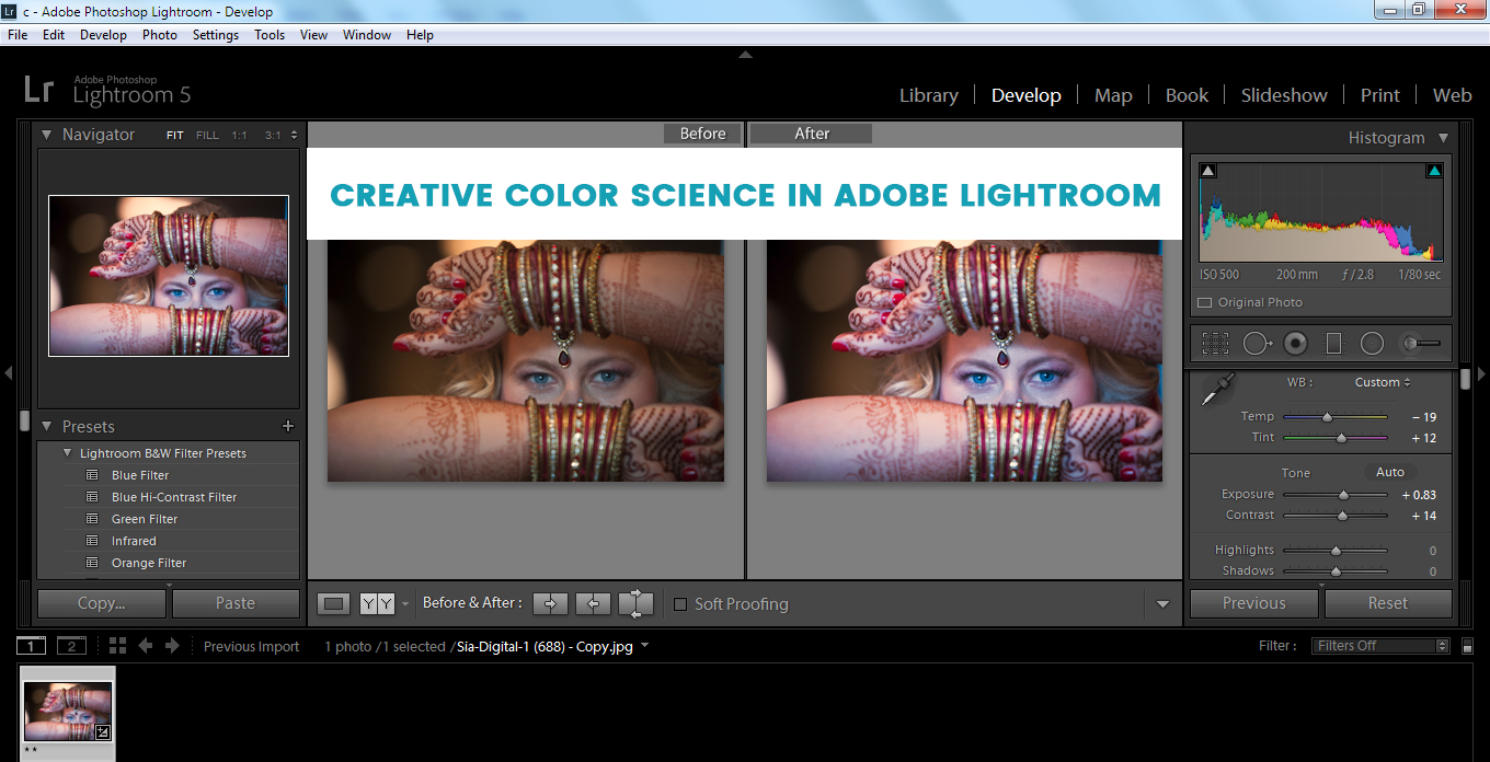
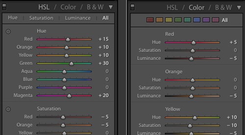
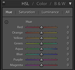
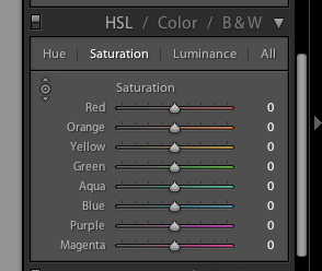
There are two ways to finely tune color in Adobe Lightroom. The HSL and Color panels are two modes for working with the same settings. You'll find this panel in the Develop module of the application on the right side, just below the Tone Curve.
This panel is labeled HSL / Color / B&W. You can work in either HSL or Color mode by clicking on the label at the top of the panel. In HSL mode, the sliders are grouped by Hue, Saturation, and Luminance.

HSL and Color are two ways of working with the same settings.
In Color mode, the sliders are grouped by color. Each color has a hue, saturation, and luminance slider.
One-Click Color Adjustments
There are easy ways to create color effects but Lightroom offers one such feature that can get you quicker: Adobe Lightroom presets are one-click effects to shift the colors in your image.
Try the premium presets from other authors to get inspiration for how to work with color. After applying a preset, you can always check out the HSL panel to see how the lightroom preset changed the colors, or even turn the changes down a bit if they're too much.
A preset can be a teaching tool and an effect.

Orange Teal Lightroom Presets
The Orange and Teal pack has a beautiful balance of complementary colors. The look that these presets apply is like ones that I've seen on leading travel channels on YouTube and Instagram.
Apply one of these presets to an image to achieve that "blockbuster" color scheme and make it stand out on social media.
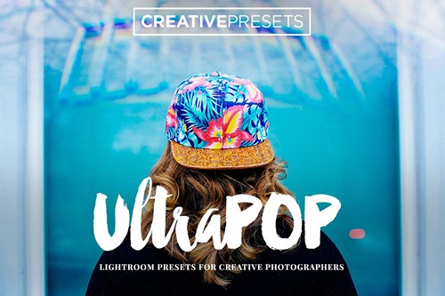
Ultra-POP Lightroom Presets
The Ultra POP collection is a selection of one-click presets that brings color to life in your images. These are far from neutral image adjustments or corrections.
With 20 different Adobe Lightroom presets in this pack, it includes a wide variety of ways to make color pop in your images, each in different ways.
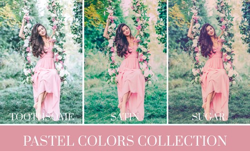
Pastel Colors
Pastel is the great colors for fashion and wedding photography. The combination of color adjustments, shifts, and overlays really brings a pastel style effect to your images.
Find Your Target Colors
To match a certain look, take the help from the references. The technique is that first find reference targets for skin tones which are applied prior to creating a look.
- Find a collection of images that you like. Do this casually and when seeing something you like by another photographer online, save it! Keep adding these images to your Lightroom catalog.
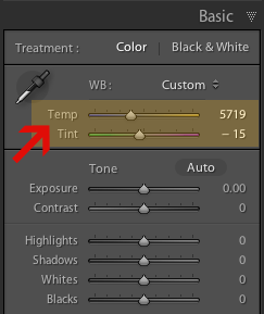
- Always use the White Balance Selector as a color picker to give you RGB percentages that will become your references
- Now find a photo from your own clicks that matches something you've saved in your collection and open it in the Develop module (D).
- Select the White Balance Selector tool (W) and move the eyedropper over the areas that have tones you'd like to match which will give you an RGB reading, with percentages for red, green, and blue. Note down the percentages for all the areas that are similar between the reference and your picture.
- While adjusting your own image try to match the target percentages.
- Start the adjustment from eye first, to get things close, and then tweak the settings until they are the same as your reference.
- Your picture might not look the way you want even if the values match.
- After you've adjusted it, evaluate it again to decide if anything needs further adjustments to get it just right.
How to Do Creative Color Adjustment?
So far, we've reviewed the color controls and how to use them in Lightroom. Mastering the color panel comes down to experimentation and forging your own style.
Here are some recipes to get started:
- Make use of the hue slider when you want to shift a hue to a neighboring color like blue to violet or orange to yellow.
- The saturation slider can be used when you want to emphasize or de-emphasize a color implying to affect the intensity of a given color.
- The luminance slider is useful for adjusting exposure for specific hues.
Review the changes
In Adobe Lightroom, reviewing the changes made till time is the easiest. You just need to press and hold the photo with one finger to see the before and after the result of the adjustments.
Do experiment with color adjustments in Lightroom with the editing controls and you will know that you can always rework your edits. You can also get back to your original photo using the Reset icon with one tap on the right of the adjustment tools.